
Ground UP operates where value is not yet visible. It reads discreet movements, early signals and unrealised potential, where knowledge, interpretation and timing make the difference between seeing an opportunity and understanding it.
Our challenge was to move away from the familiar language of luxury that dominates real estate branding. We looked instead at where value comes from: the base, the structure, the decisions made before everything else. From the ground up.
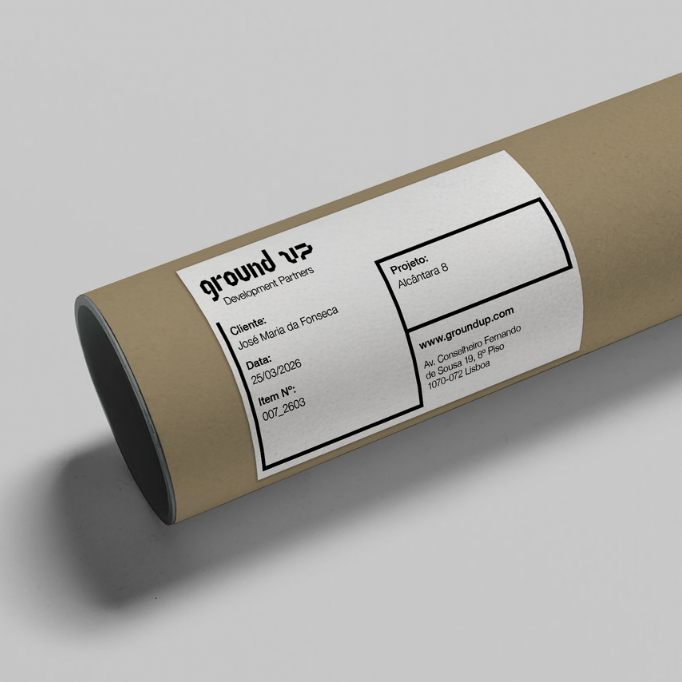
Before defining how Ground UP should look, we defined how it should think and act.
Together, we built a strategic foundation around four values: trust, precision, agility and discretion. Ground UP is a development partner informed by privileged knowledge and experience, able to identify, structure and realise opportunities before their potential becomes evident.
Its business purpose is clear: to turn those opportunities into lasting growth for investors and partners, balancing return, security and long-term value.
This idea of acting early became central to the brand.
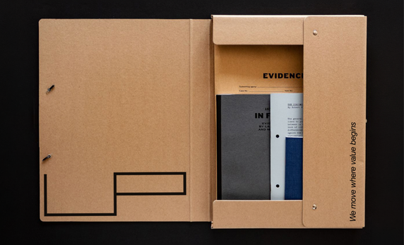
We move where value begins.

“We move” expresses Ground UP’s proactive way of operating.
“Where value begins” places that movement at the origin: where potential is identified, decisions are structured and future value starts taking form. It also connects the signature directly to the name. Value is identified early, then structured and built from its foundations.
The signature was designed to adapt. “We move” can stand alone or combine with different complements: We move… with intelligence, with insight, with precision, with purpose, with the unseen, with value, with you…
The words can change with the context without changing the attitude behind them.
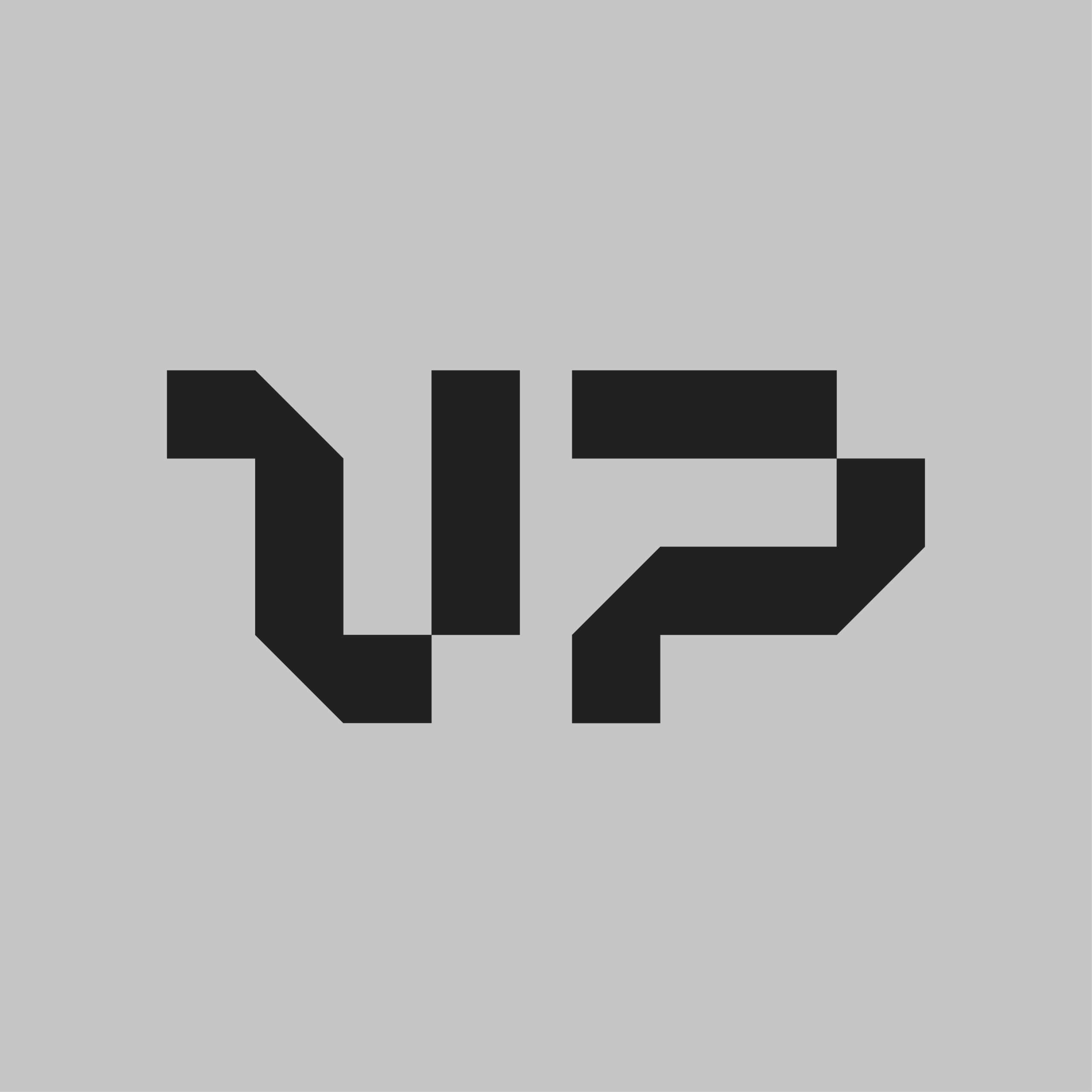
We started with a square, the simplest unit in the system. A symbol for stability, racionality, order.
Every form in the identity originates here. Squares combine into structures and, divided diagonally, become triangles. When two units meet only at a vertex, that minimal point of contact introduces tension and gives the composition a particular sense of precision.
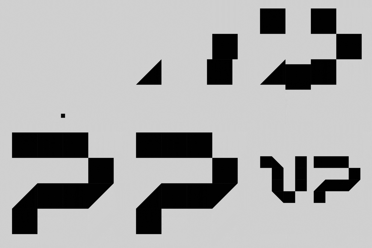
This relationship between modularity and precision reflects Ground UP’s method: larger structures developed from a set of clear, deliberate decisions.
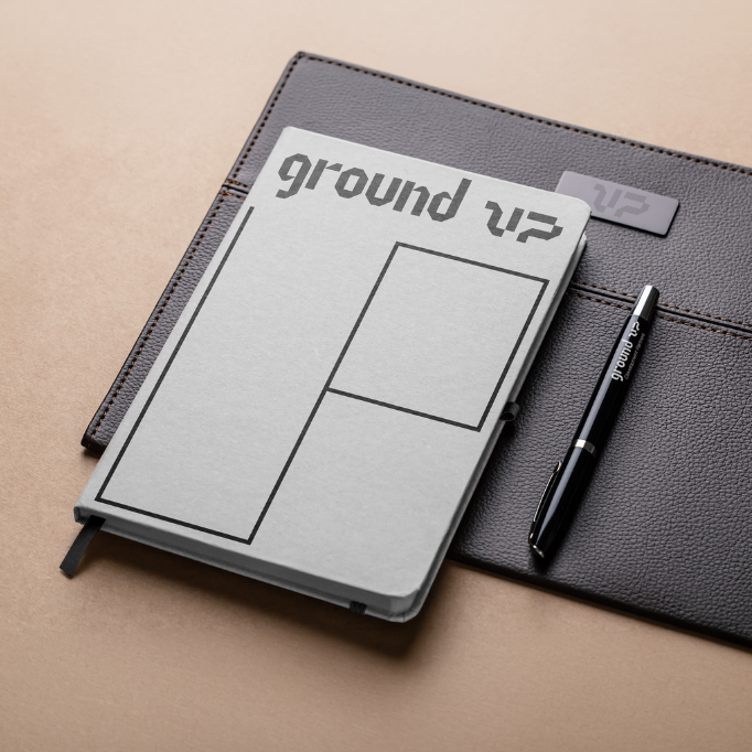
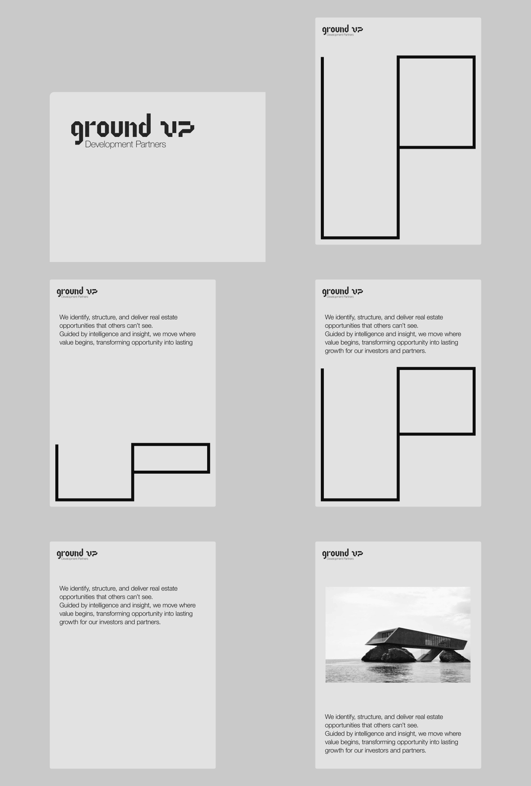
The square extends beyond the construction of the mark. The same unit generates frames, graphic accents and other elements across the identity.
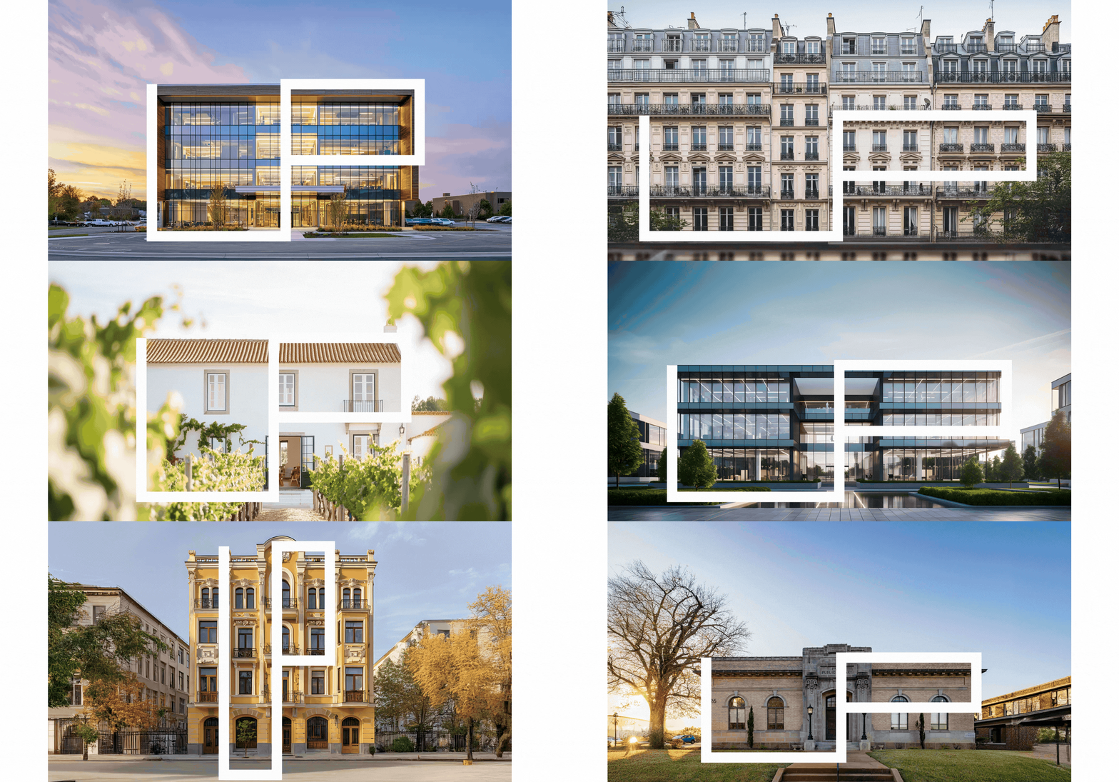
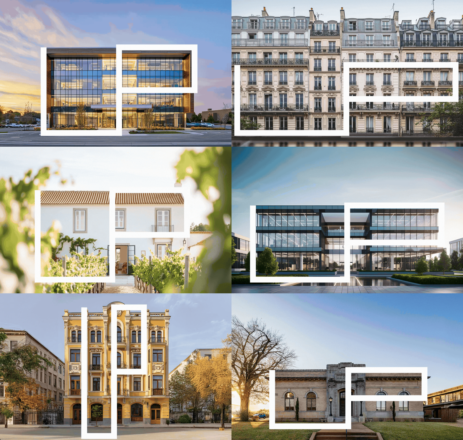
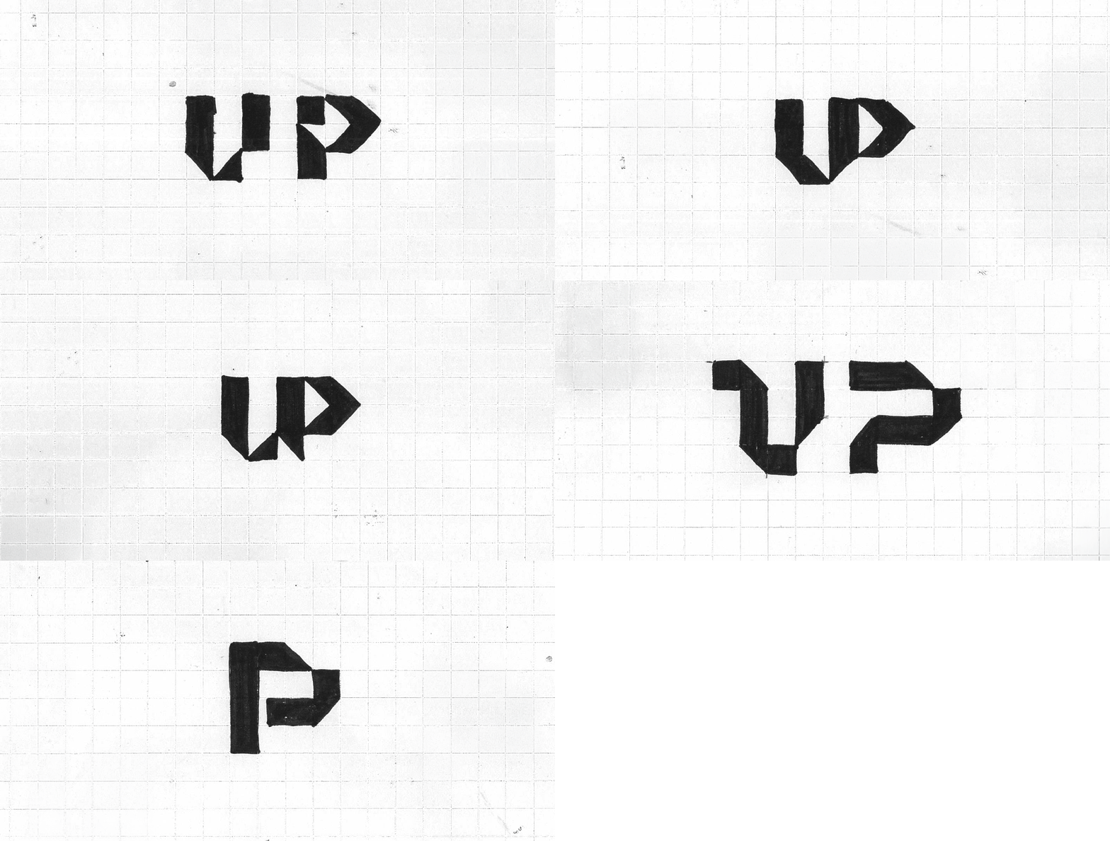
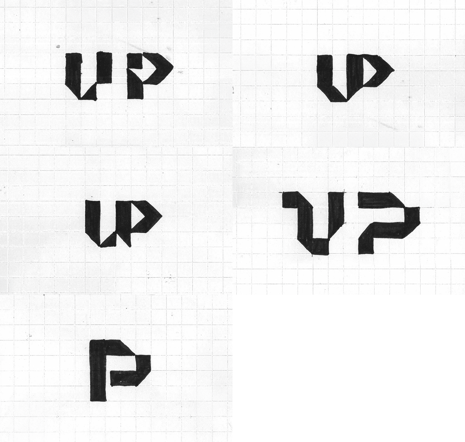




The same system generates the UP element.
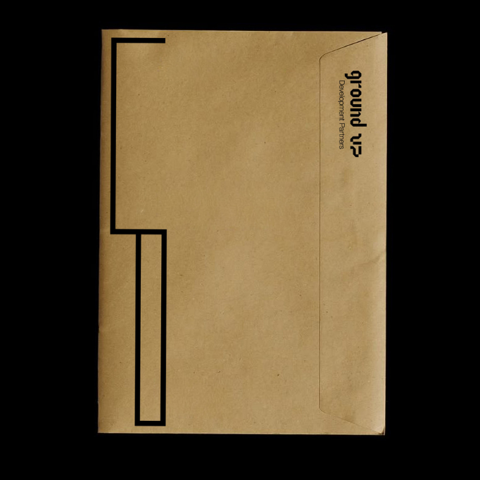
Drawn as a continuous orthogonal form, it carries the rationality of the grid while adding movement and adaptability.
It can extend horizontally, stretch vertically, contract or expand into different proportions. It can occupy empty space or create space to hold information.
The proportions respond to each format and application, allowing the element to adjust to different contexts while remaining recognisable.
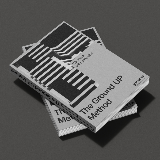
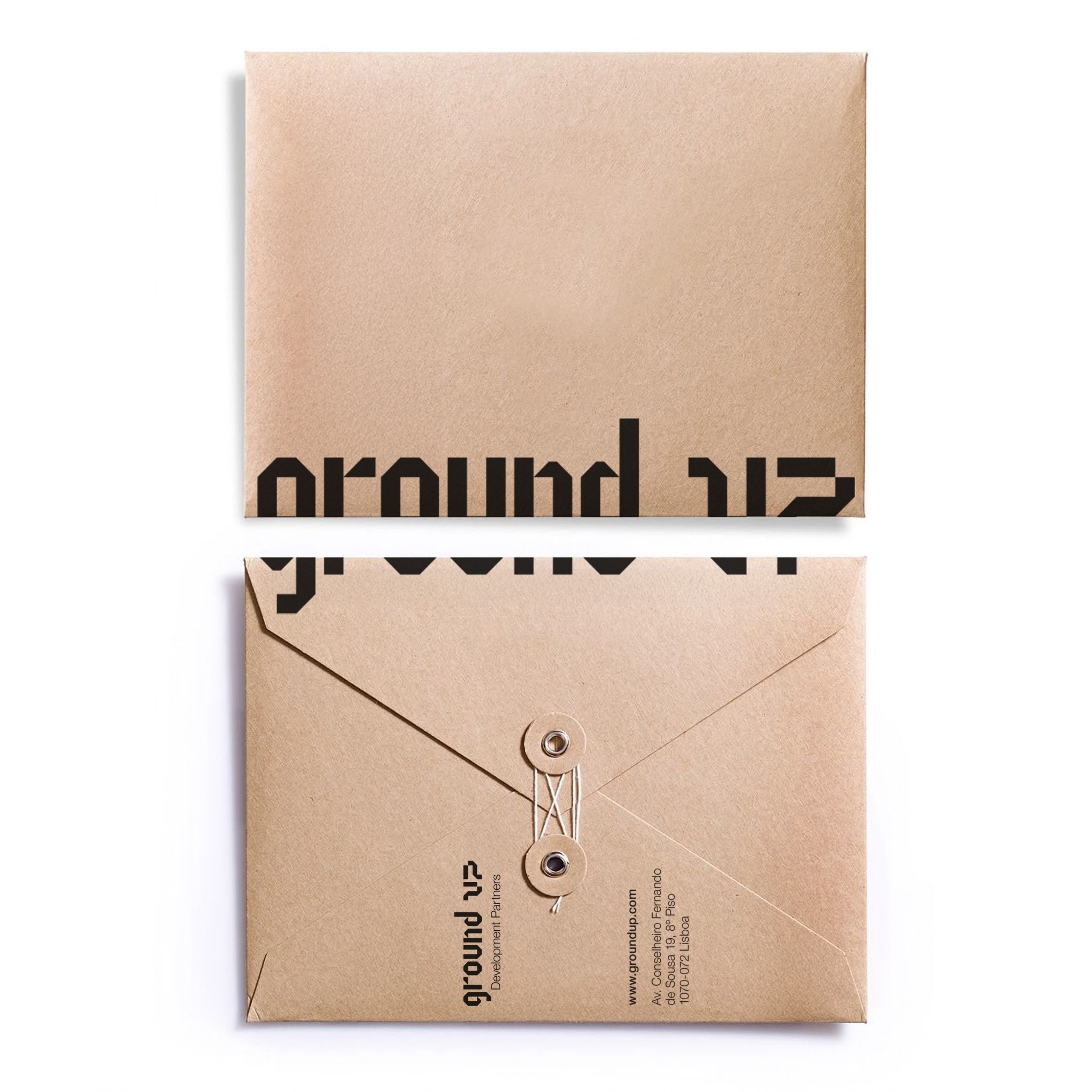
We removed colour from the identity almost entirely.
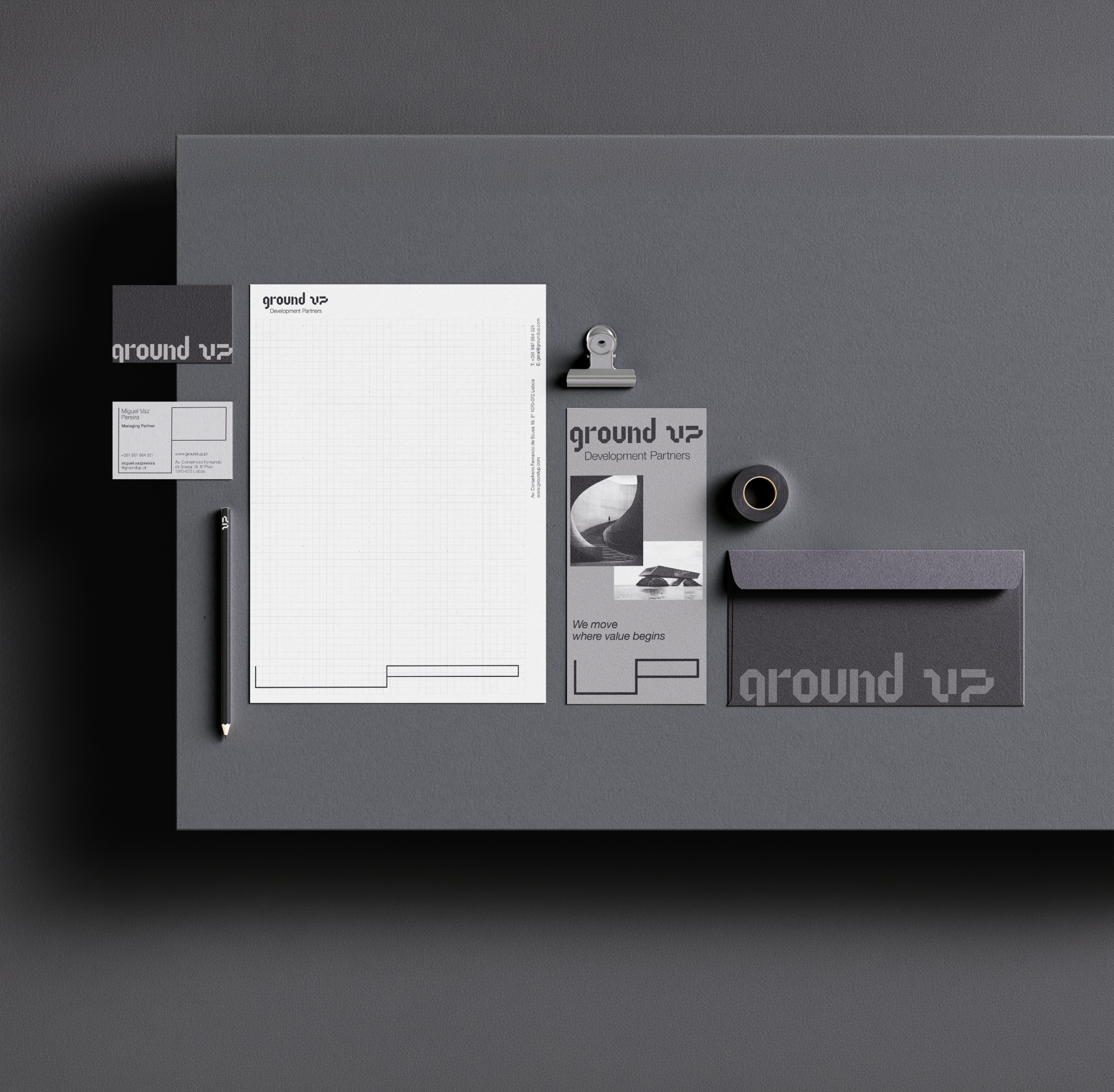
Ground UP exists between black and white, without reaching either extreme. A controlled spectrum runs from Charcoal to Off-White, creating hierarchy and contrast through calibrated shades of grey.
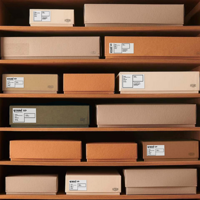
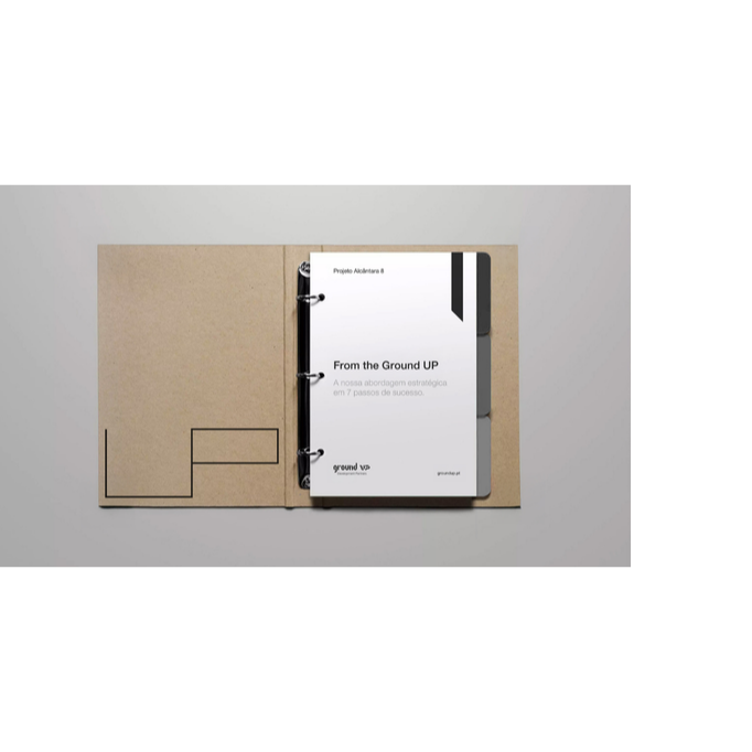
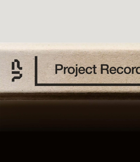
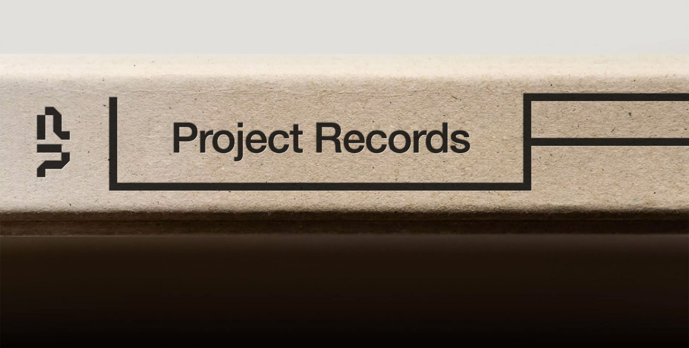
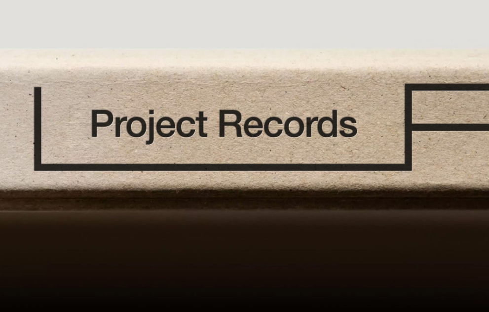
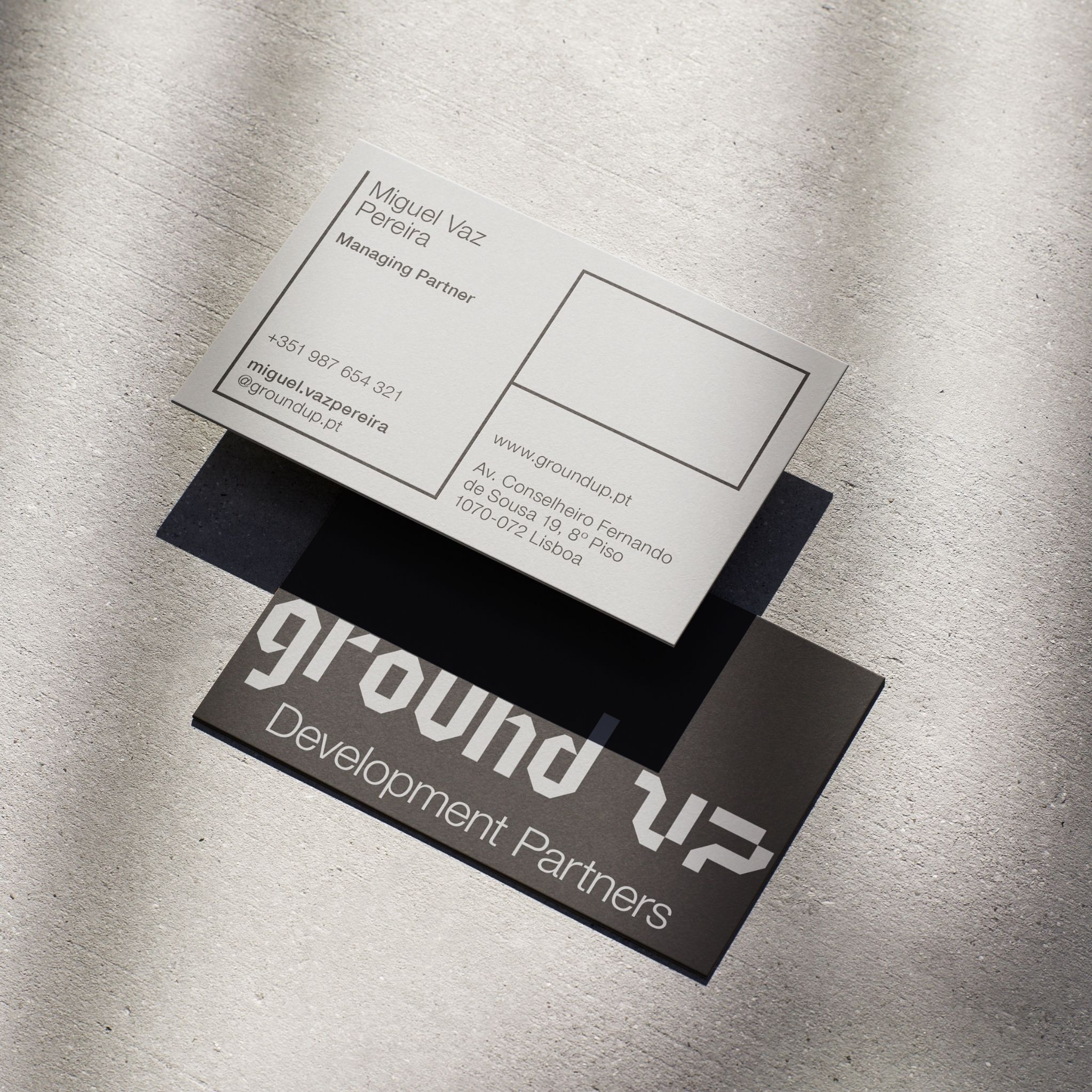
In physical applications, grey is replaced by kraft paper: paper in its most natural state, produced without adding pigment. The stationery follows the same rationale in its use of colour, keeping the material itself as the closest expression of the palette.
This restraint keeps the focus on structure, proportion, information and content. It also gives the identity a level of discretion appropriate to the way Ground UP operates.
The result is a palette defined less by colour itself than by contrast, hierarchy and control.

The same unit that constructs the identity also organises the space around it.
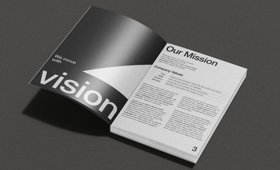
We built the graphic system on a square grid, establishing a clear logic for alignment, proportion and hierarchy. It provides a stable structure that can expand, compress and respond to different formats.
Within it, the UP element works as both a graphic device and a spatial structure. It can frame information, occupy a margin or adapt to the proportions of the page.
Because the applications share the same underlying grid, consistency comes from the construction of the system itself.
The photographic language follows the same discipline.
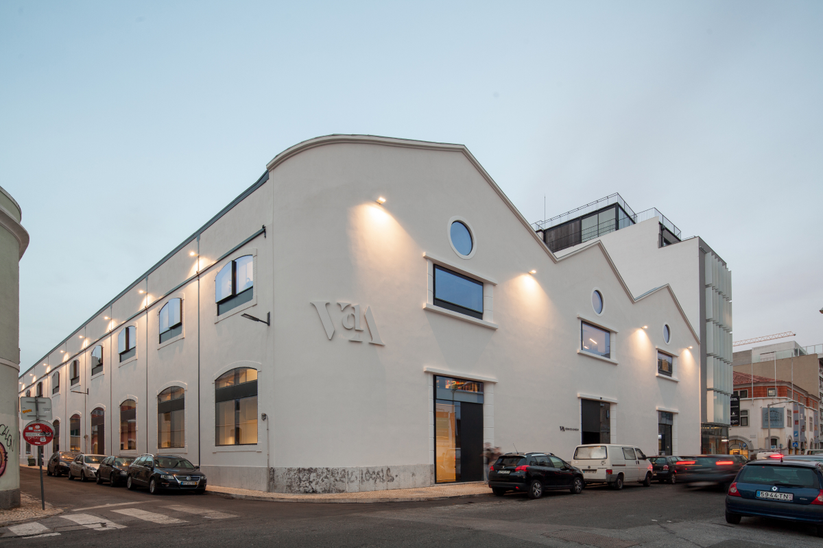
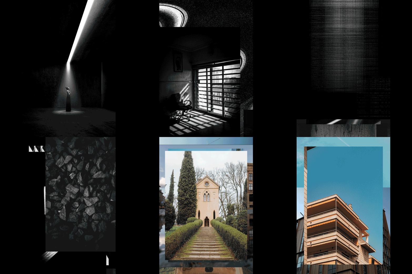
Composition is rigorous and architectural. Lines, materials, light and depth give the images structure, while an indirect human presence introduces scale and sensibility without turning the imagery into lifestyle photography.
Photography is also the point where the visual system changes.
Until here, the identity remains in grayscale. The projects appear in colour.
They are the material expression of Ground UP’s work and become the most expressive part of the communication. The graphic language stays deliberately restrained around them, giving the architecture and places room to lead.
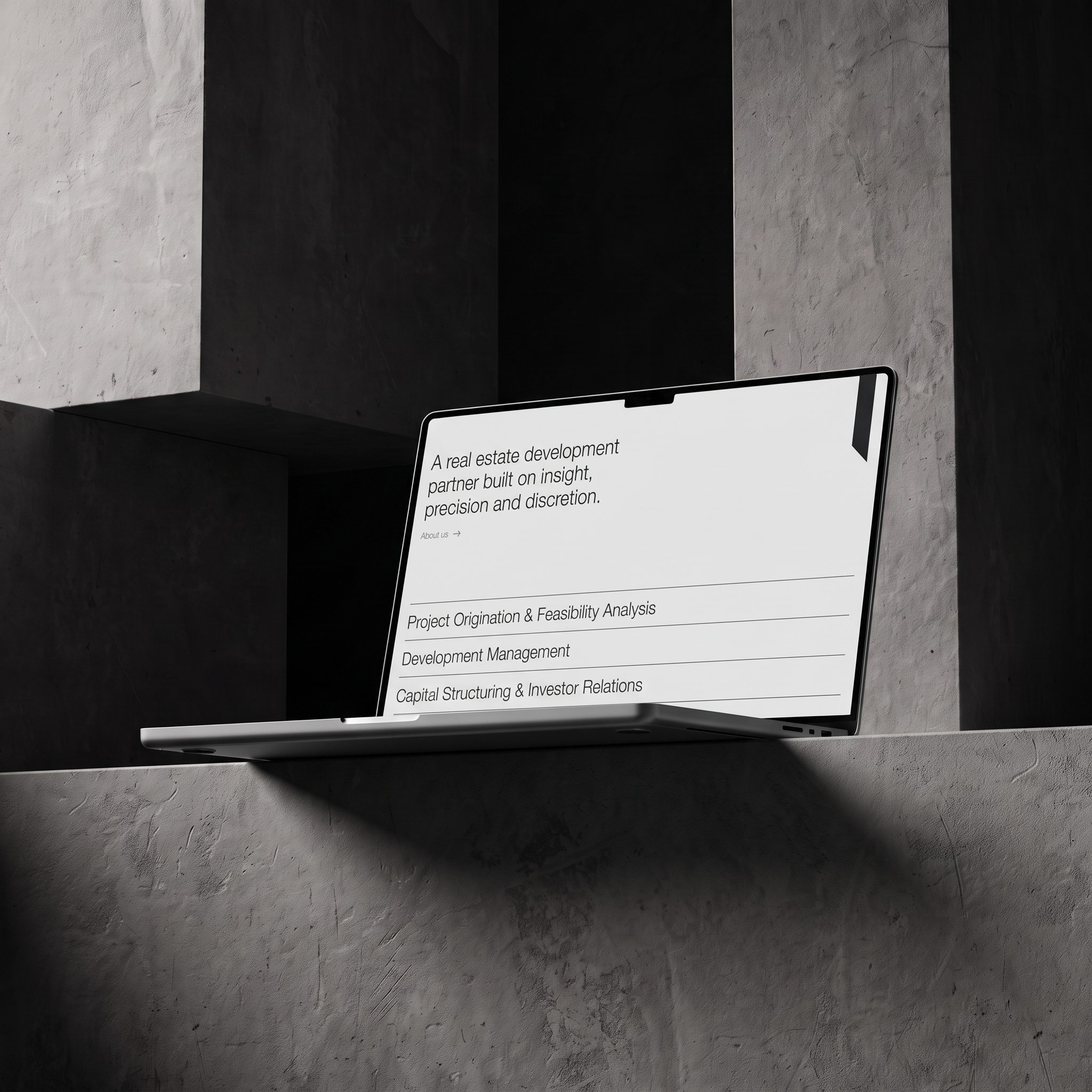
The website translates the identity into a digital environment.
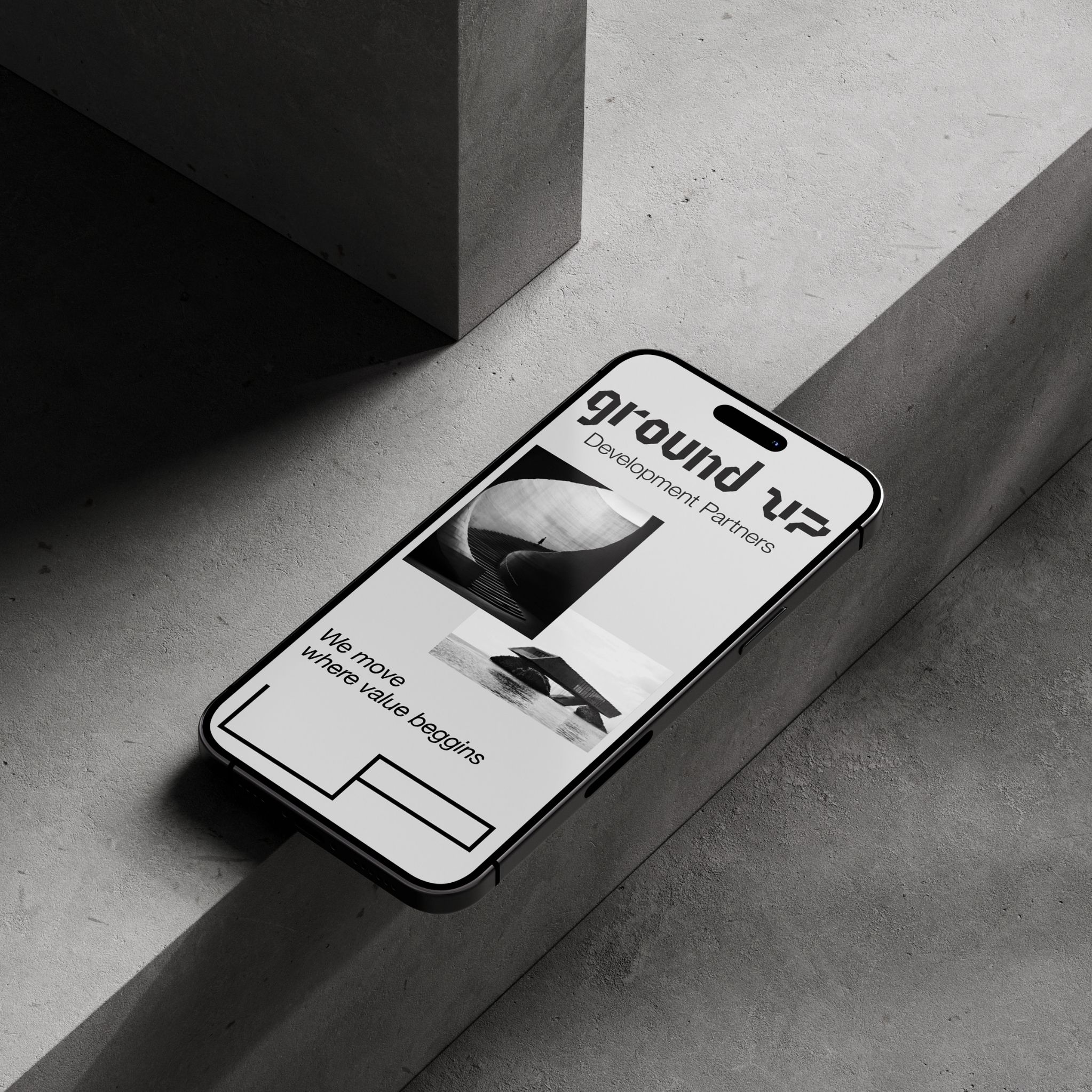
The grid, modular structure, grayscale palette and adaptable UP element establish the framework for the experience.
Information follows a clear hierarchy, while motion extends the modular logic of the identity into the interface. As users move through the site, project imagery gradually takes the foreground. Colour remains with the work itself, surrounded by a deliberately neutral interface.
The website brings the different parts of the identity together in use, from typography and structure to movement and photography.
One system, built from the ground up.