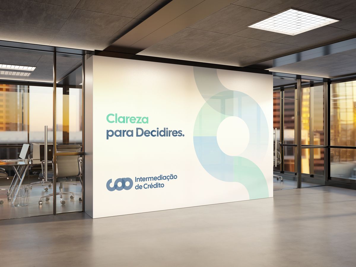



Credit intermediation operates in a context shaped by technical information, complex processes, and decisions with significant consequences.
COB needed to communicate expertise and credibility without adding another layer of complexity. The challenge was to make the service feel clear and approachable while retaining the rigour expected from a financial intermediary.


We developed the brand strategy, positioning, naming and identity around this tension. Instead of focusing only on simplifying financial products, we defined COB’s role around something broader: simplifying the decision itself.
This positioned clarity as a practical part of the service, a way of turning information into orientation.


The identity began with a circle.
As a closed form, it suggests balance and continuity. By opening it, we introduced another set of ideas: transparency, dialogue, movement and direction. This became the central principle of the identity: opening creates direction.


The open circle forms the basis of the symbol and extends into the wider graphic system. Through overlap, transparency, and directional compositions, it represents COB’s role between people, knowledge, and financial institutions.
A single geometric principle could therefore carry both the strategic idea behind the brand and the visual language used to communicate it.


COB communicates with different audiences. Individuals need accessible guidance through personal financial decisions, while partners and businesses require an expression that can operate in a more institutional context.
We structured the colour system around these two poles: Consumer and Business.


Rather than separating them into independent identities, a transitional palette connects both expressions. Colour can shift according to audience and context while the underlying geometry, typography and graphic behaviour remain consistent.
The result is a system that can change its degree of proximity or institutional presence without changing the brand behind it.
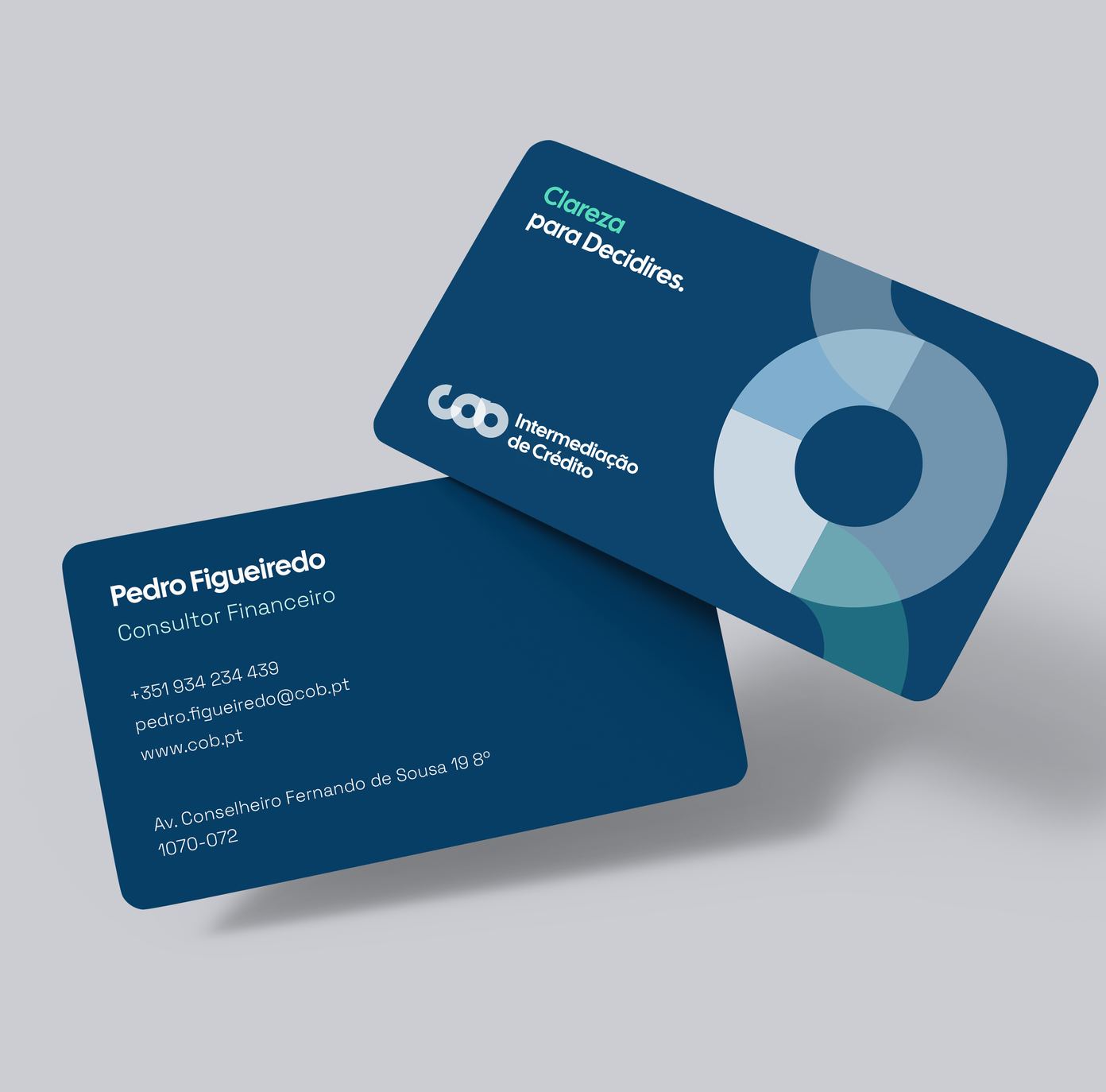
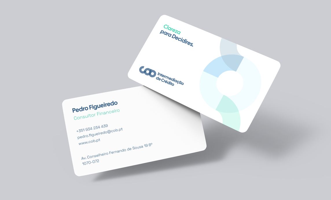
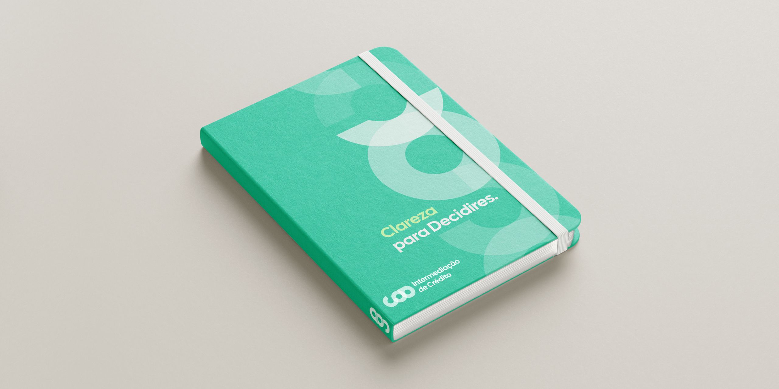
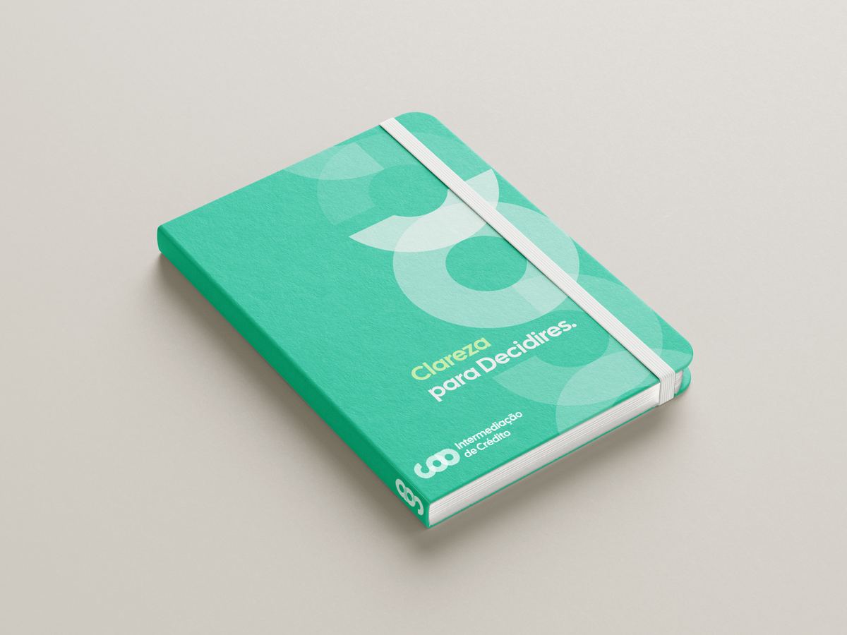
The same principle extends to the way COB speaks.
We defined a verbal language based on direct sentences, active verbs, and accessible financial communication, avoiding unnecessary complexity while retaining precision.
The signature adapts to the two principal audiences. “Clareza para Decidires.” addresses Consumer communication directly, while “Clareza para Decidir.” gives Business communication a more neutral register.
Both express the same position: COB provides the knowledge and orientation needed to make a decision clearer.


The identity brings the visual and verbal components into a single framework.
Cal Sans leads designation, headlines and campaign communication, with Helvetica Neue supporting body copy and interface requirements. Photography follows a similarly direct approach, using real moments, natural light and calm compositions to keep communication close to everyday experience.
Across applications, the open-circle geometry, typography and principles of transparency and direction remain constant. Colour, graphic intensity, brand versions and verbal expression can adjust according to audience and format.






Together, these elements give COB a coherent brand system for communicating a complex financial service with greater clarity, proximity and consistency.