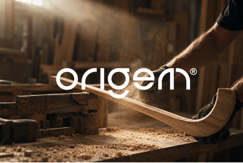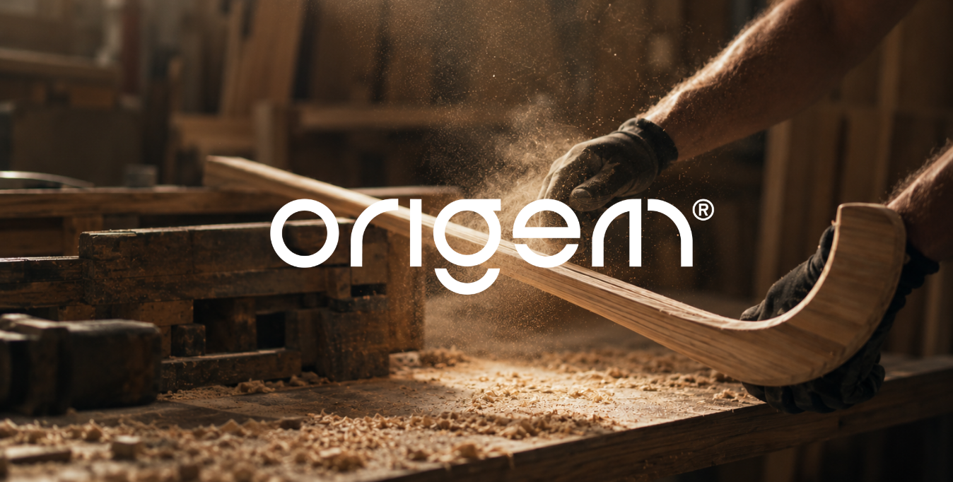
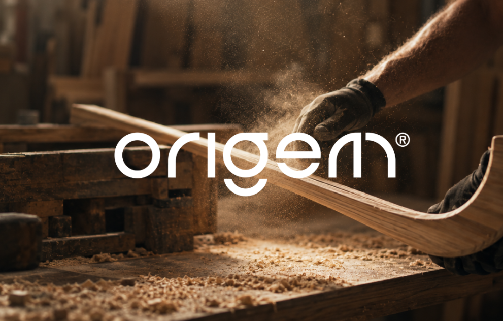
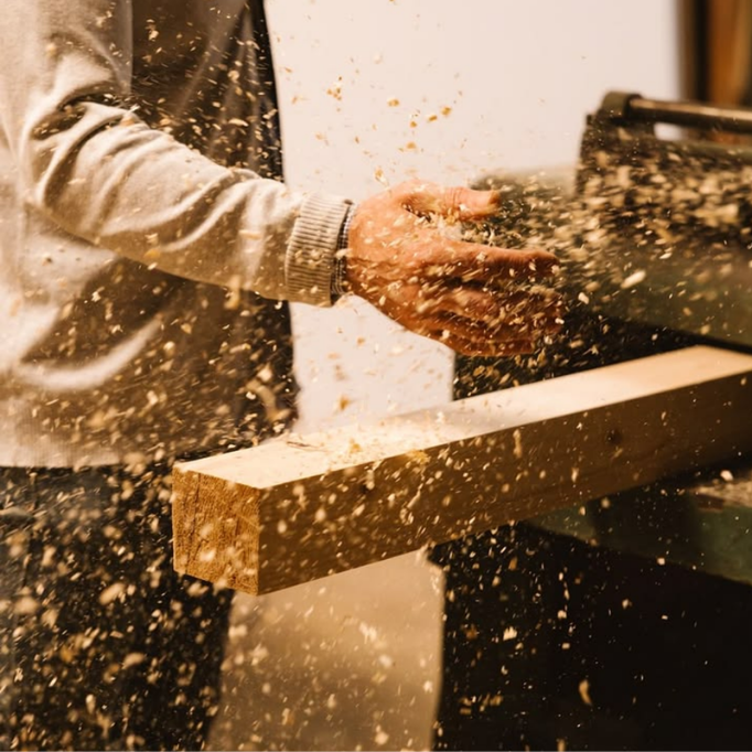
The starting point for ORIGEM was unusually specific. Its material already had a previous function, a proven resistance, and visible traces of use.
The challenge was to preserve that provenance without allowing sport to become the theme of the collection. Circularity could explain where the material came from, but it was not enough to define what the furniture should become.
We identified the opportunity in the continuity between two apparently different functions. The properties that allowed a hockey stick to withstand impact remain present when its sporting life ends. Through design, those same capacities can support another relationship with the body: impact becomes support, movement gives way to pause, effort to rest.
This shift became the foundation for the brand.
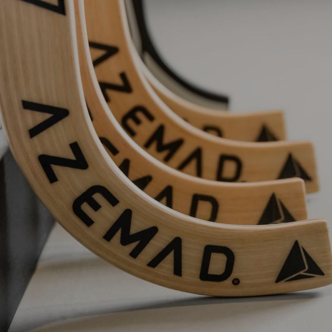
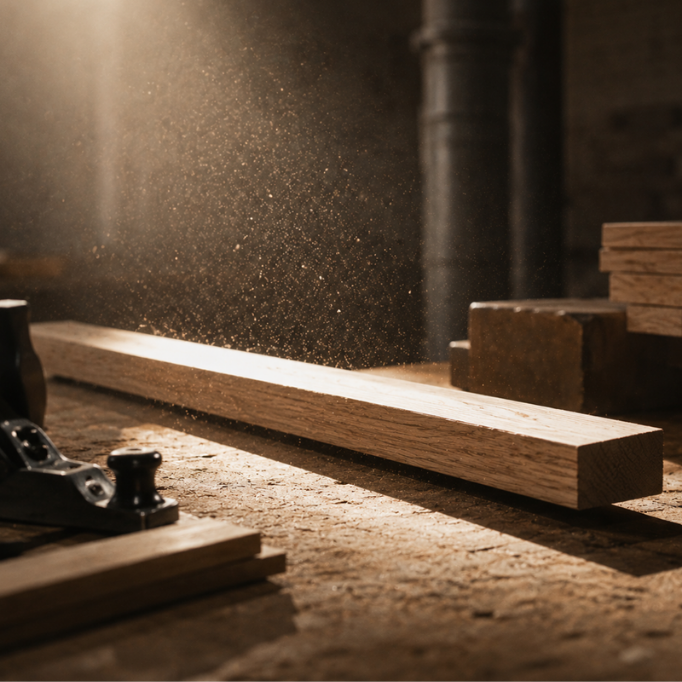
We structured ORIGEM around a simple principle: The material remains. The relationship transforms.
The collection does not erase the previous life of its material. It uses that history as the basis for a new function and a new experience.
From this principle, we defined three dimensions for the brand: Material, Design and Permanence. Material establishes provenance and memory. Design is the agent that changes the relationship between material, body and space. Permanence extends its original resistance into a different understanding of duration, the capacity to continue, adapt and remain useful.
Together, these dimensions gave us a framework for developing both the narrative and the visual identity without reducing the project to a sustainability claim.
We developed the graphic system from the word ORIGEM itself.
Forms and segments derived from the logotype can be separated, rearranged, and recombined, creating compositions that change across different formats while retaining a common origin. The identity’s behaviour mirrors the collection’s material logic: existing elements are preserved, transformed, and placed into new relationships.
This gives the system flexibility without depending on a fixed composition. Scale, configuration and the relationship between word, graphic form and image can change according to the application, while the construction principle remains recognisable.
Transformation becomes part of how the identity behaves.

The visual language remains close to the physical character of the project.
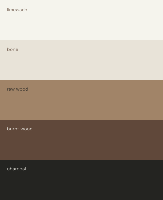
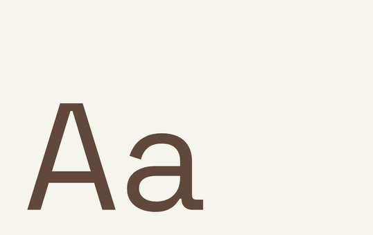
We selected Space Grotesk as the typographic foundation and developed a palette around different states and readings of matter: Cal, Osso, Madeira Crua, Madeira Queimada and Carvão. Texture introduces irregularity, traces and surface variation into the system, allowing the material history to remain perceptible within the communication.
References to sport are deliberately residual. They can appear as traces of provenance, but never become an illustrative theme.
This balance allows the furniture and its materiality to remain central, with the identity providing a framework around them rather than competing for attention.
The same principle of transformation structures the collection itself.
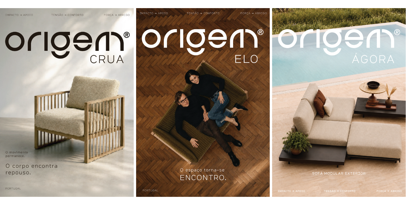
We organised its three pieces around an expanding scale of human relationship: individual, other, community.
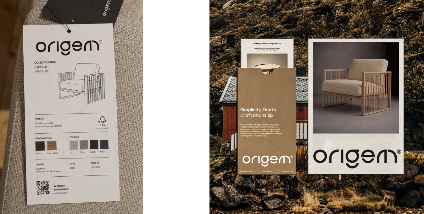
CRUA begins with the individual. It establishes the most direct and intimate relationship between material and body.
ELO introduces connection, bringing two people into relation.
ÁGORA expands that logic into a collective setting. Its modular character allows the system to grow and adapt to different configurations, extending the collection from an object into a shared spatial condition.
The names and structure give the three typologies a common conceptual architecture. As the furniture changes in scale, the relationship it enables changes with it.
Across the identity, applications and collection, ORIGEM is built on continuity.
The provenance of the material remains visible. Graphic elements can be dismantled and recombined. The furniture progresses from individual use to collective configurations. Each part changes according to context, while retaining the logic from which it began.
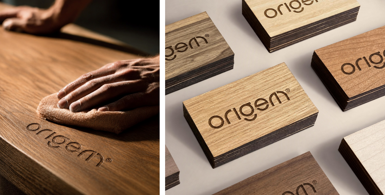
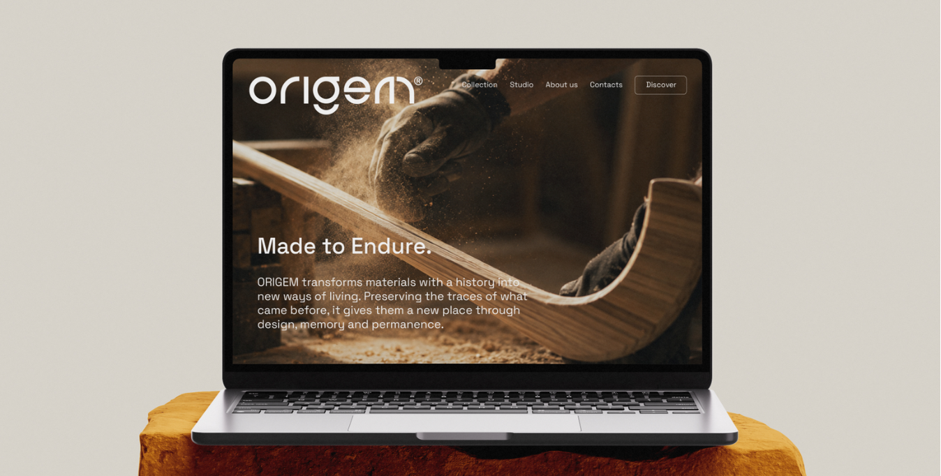
Our work brought these layers together into one brand system, from positioning and narrative to naming, visual identity, collection architecture and digital applications.
The result is an identity grounded in a material fact: what has already had one life can retain its properties, change its relationship with us and continue in another form.