Project delivery is built around the coordination of multiple disciplines, decisions and interests. Yet much of the value created through that coordination remains invisible.
INTEGRA was established to approach this process differently, combining Project Management, Design Management, Construction Management, Sourcing and Procurement within an integrated service. Alongside cost and programme, the company places particular emphasis on design quality and on maintaining the integrity of a project from initial decisions through to execution.
Our challenge was to give this proposition a clear position in the market. The brand needed to establish credibility in a highly technical sector while distinguishing INTEGRA from businesses perceived primarily through an operational or supervisory role.
We identified integration as the clearest expression of both the service and the value behind it.
A project involves architects, engineers, contractors, suppliers and clients, each working with different priorities and responsibilities. INTEGRA’s role is to connect these parts: structuring information, aligning decisions, anticipating problems and maintaining coherence between the original vision and what is ultimately delivered.
This became the organising principle for the brand. Rather than describing individual services in isolation, we built the positioning around INTEGRA’s ability to bring them together into a coordinated whole.
The same principle led to the name.
INTEGRA describes an active role: connecting design, cost, construction, teams and decisions within one coordinated process. It gives a complex offer a direct idea that can extend across different services and, potentially, different markets.
The name also provided a common foundation for the positioning, verbal language and visual identity. Instead of relying on the conventional vocabulary of project or construction management, the brand could define itself through the value created between disciplines.
The positioning places INTEGRA clearly on the client’s side.
We developed the signature Built in your best interest to express this relationship. It frames project delivery as an act of responsibility: protecting the coherence of the project, anticipating risk and making decisions according to the client’s objectives.
Three values structure this attitude — clarity, precision and integrity — and establish a consistent basis for how the company communicates and operates.
Together, the positioning and signature shift the emphasis from managing a process to taking responsibility for how its many parts come together.

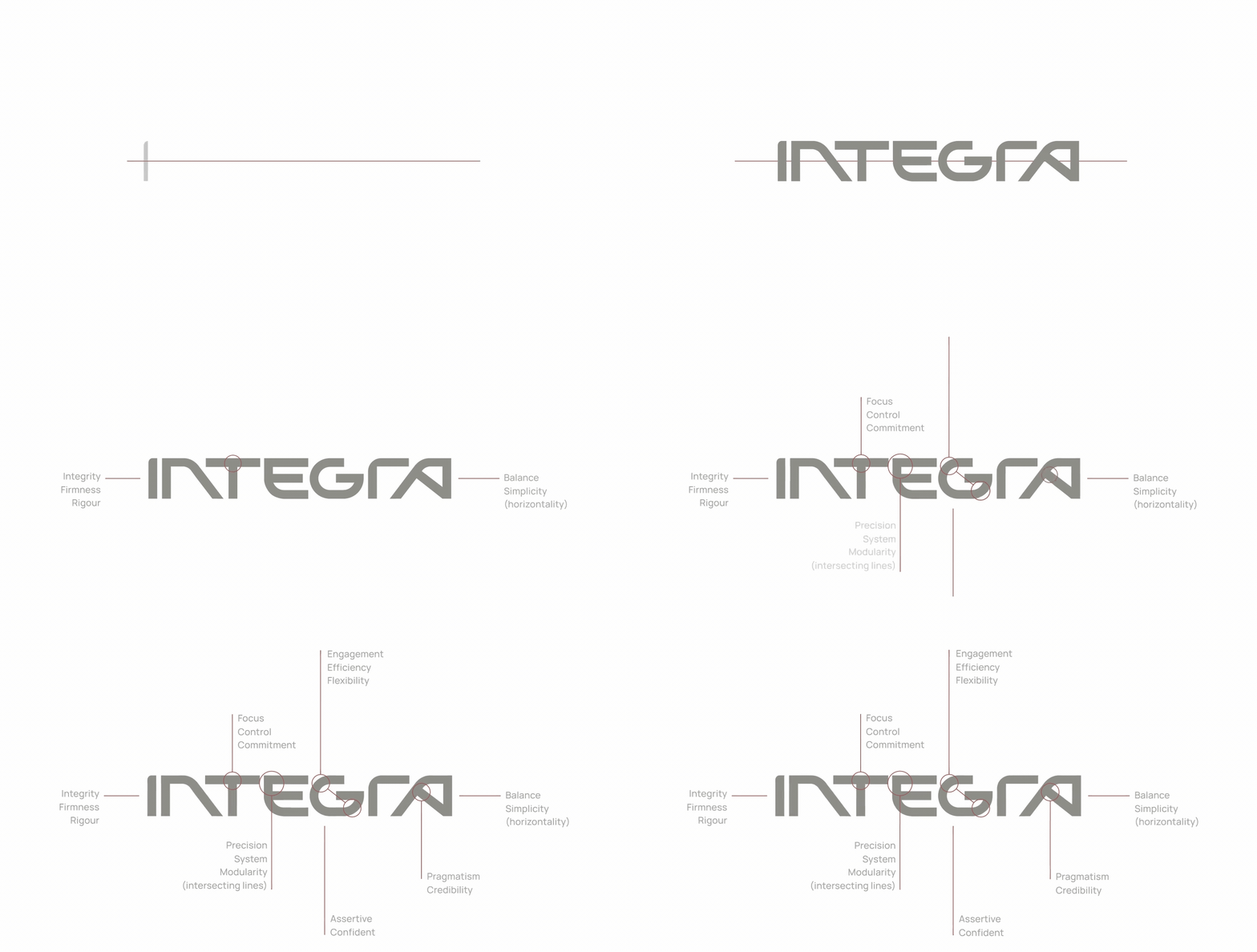
We translated integration into the construction of the visual identity.
The graphic system is built from distinct geometric elements that move towards one another and combine into a single form. Individual parts remain identifiable, but their relationship creates a coherent whole.
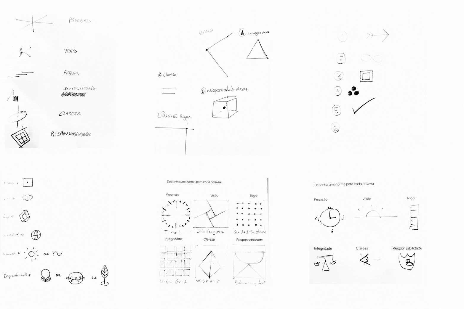
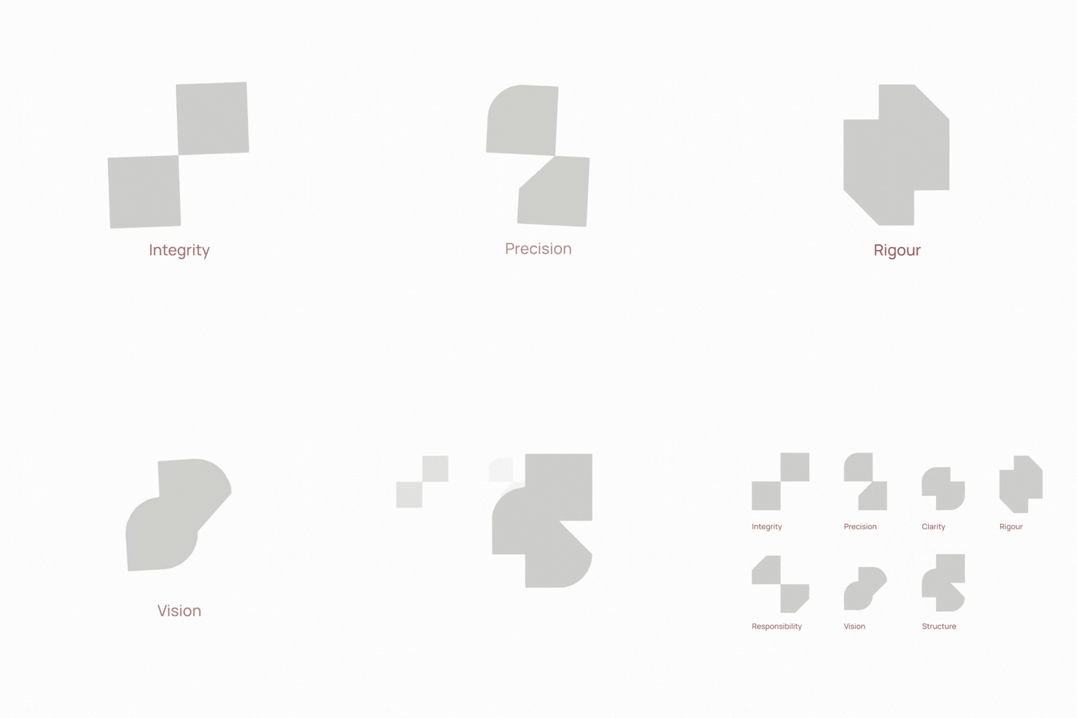
This principle gives the identity a modular structure. Geometries, proportions and scale can change according to the application while the underlying behaviour remains consistent.
The system therefore reflects the same logic as INTEGRA’s work: different components are organised, aligned and brought under control without removing their individual role.
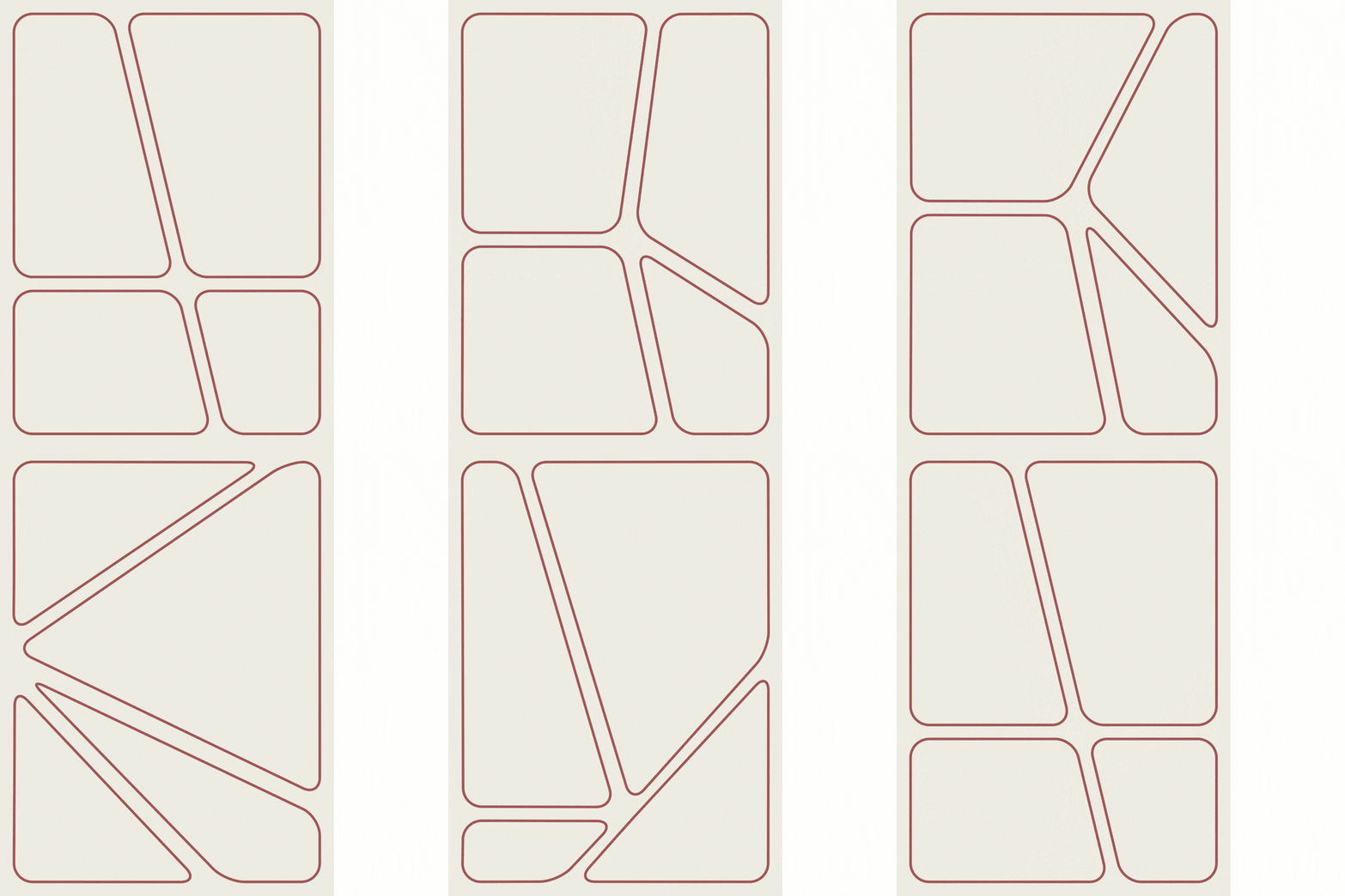

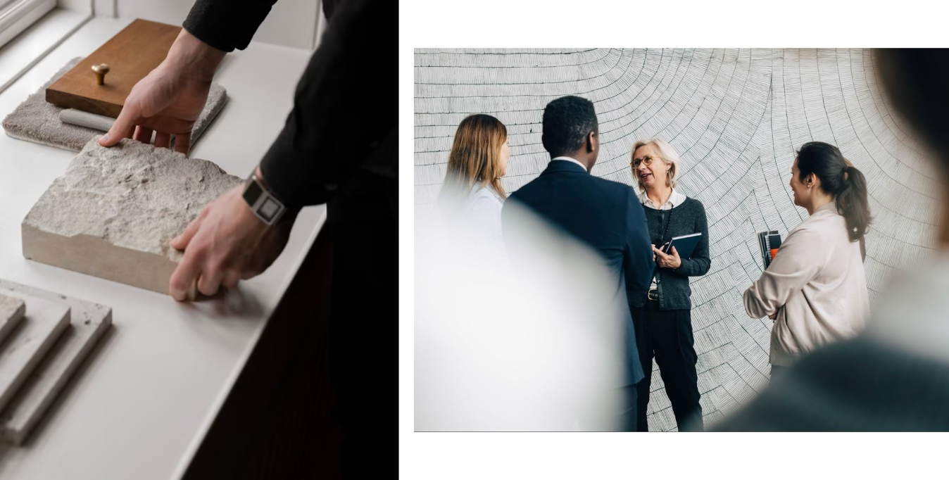
We deliberately positioned the visual language closer to architecture and high-end interiors than to the conventional codes of construction.
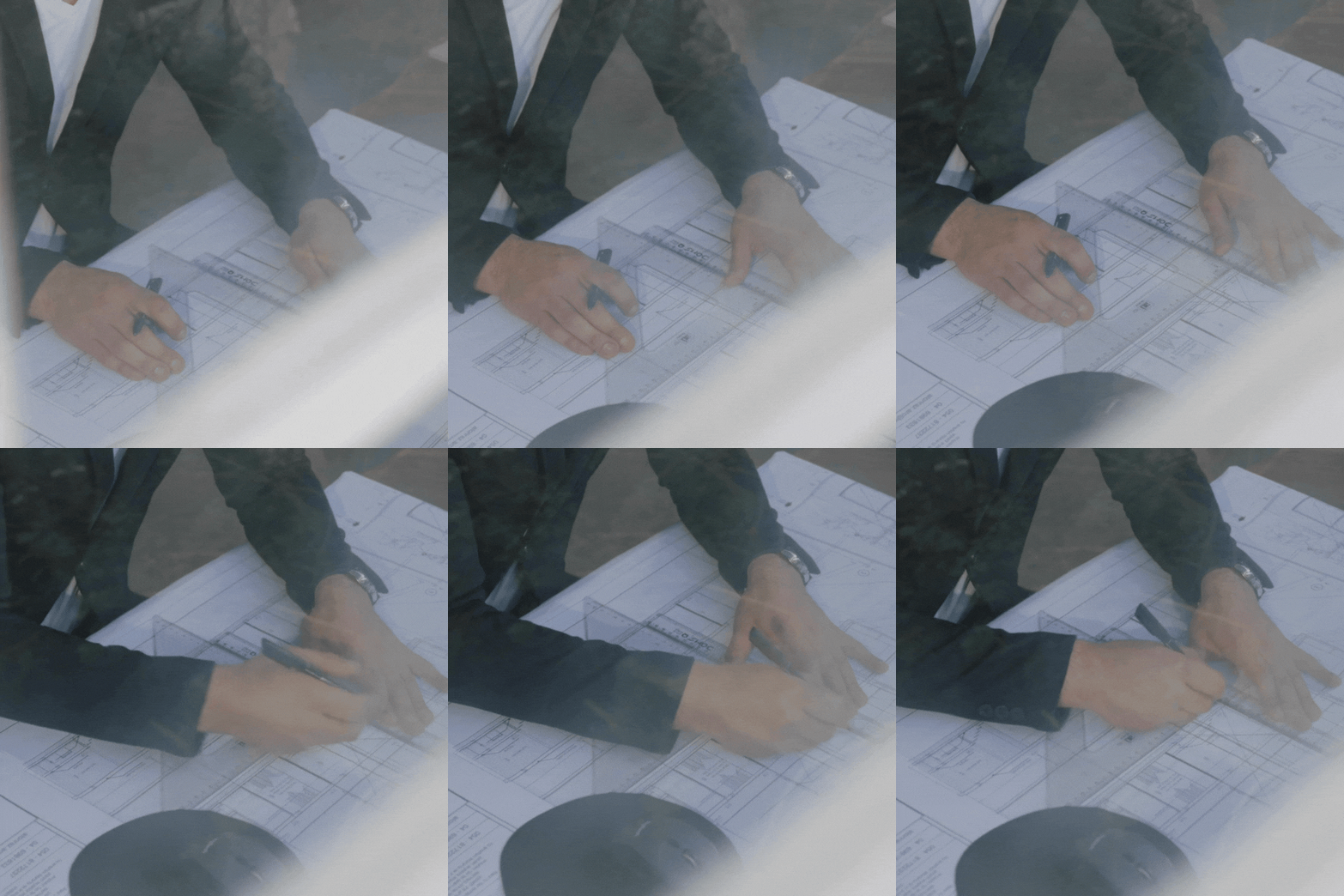
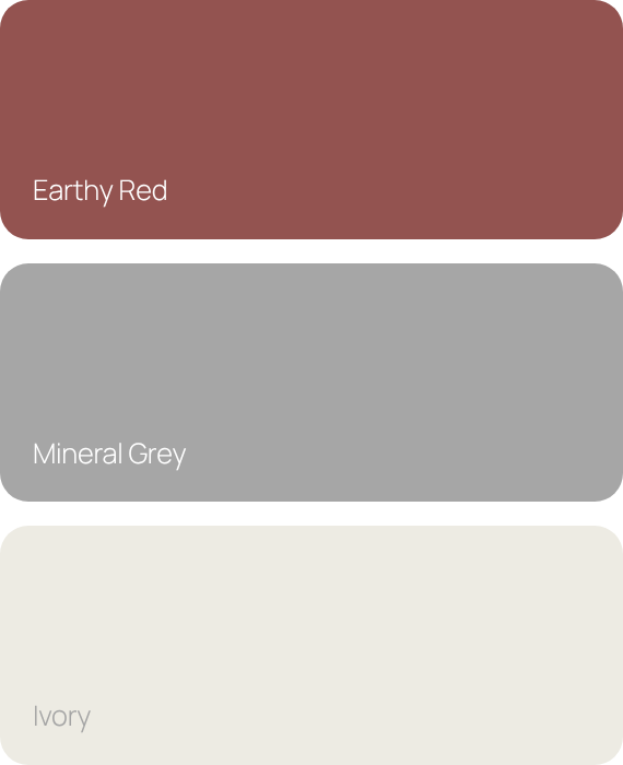
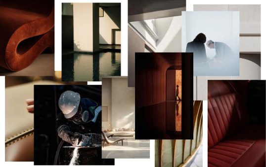
The palette draws on architectural materials, combining an earthy red, mineral grey, and ivory. Manrope provides a clear typographic framework, while the photographic direction focuses on material, light, detail, intersections and scale.
Images are composed with restraint and precision. Together with the graphic system, they create a controlled visual environment intended to communicate the same sense of confidence and oversight that INTEGRA brings to a project.
The identity was designed to move between corporate communication and the environments in which projects are delivered.
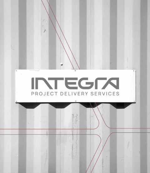
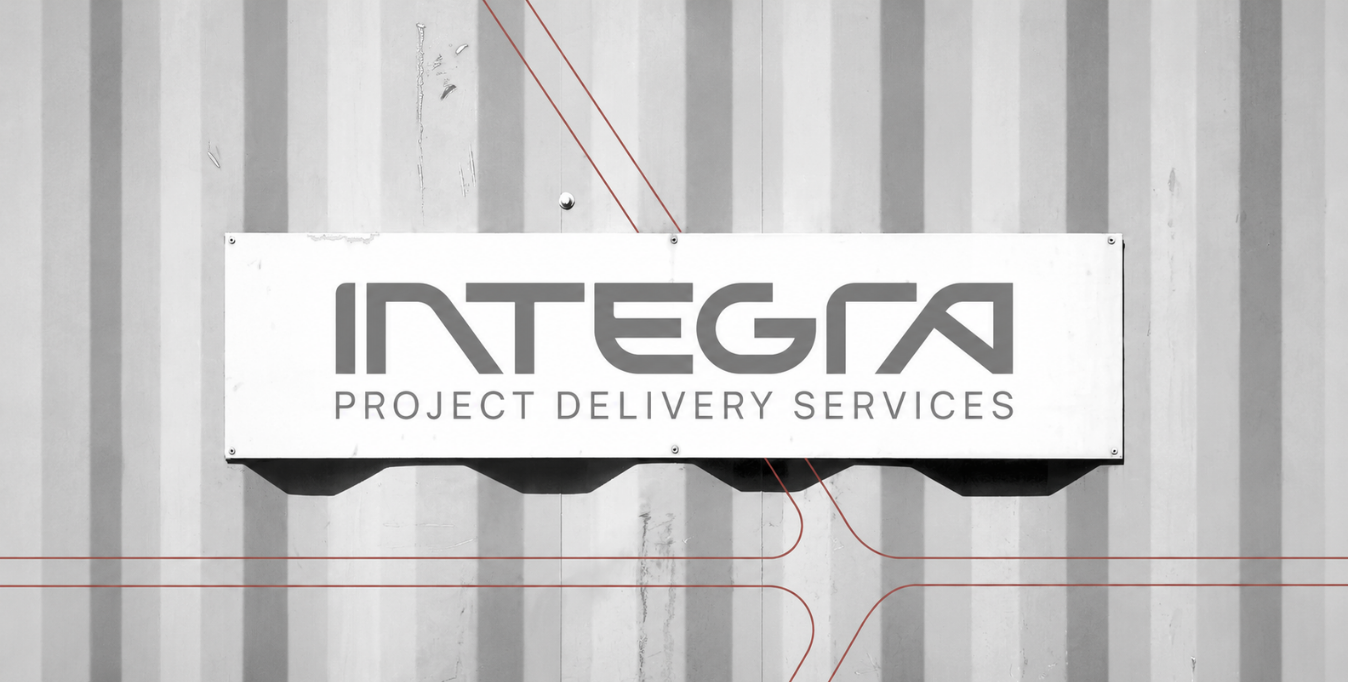
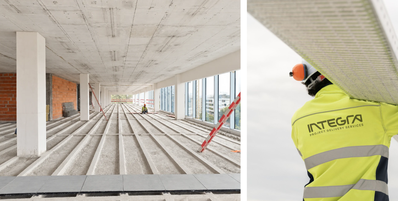
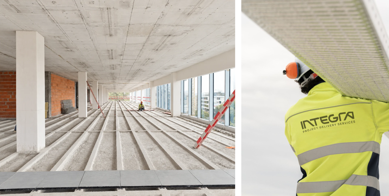
The modular system extends across stationery, editorial materials, institutional communication and digital interfaces, as well as construction-site applications, signage and equipment. Its geometry can expand, contract and reorganise according to each format, while typography, colour and composition maintain continuity.
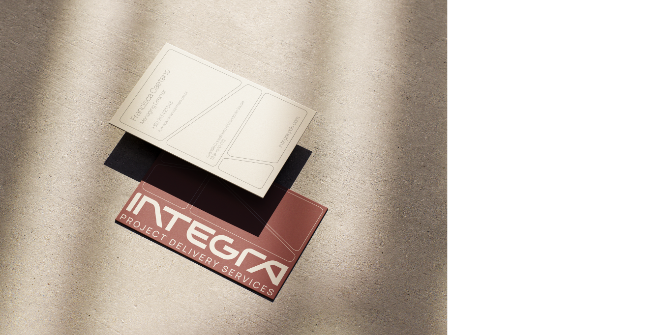
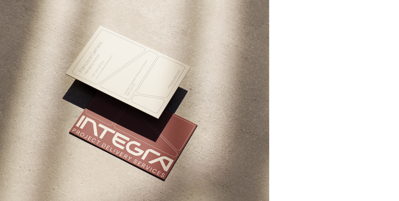
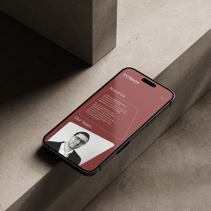
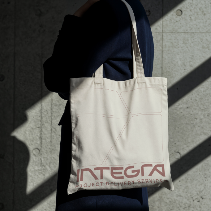
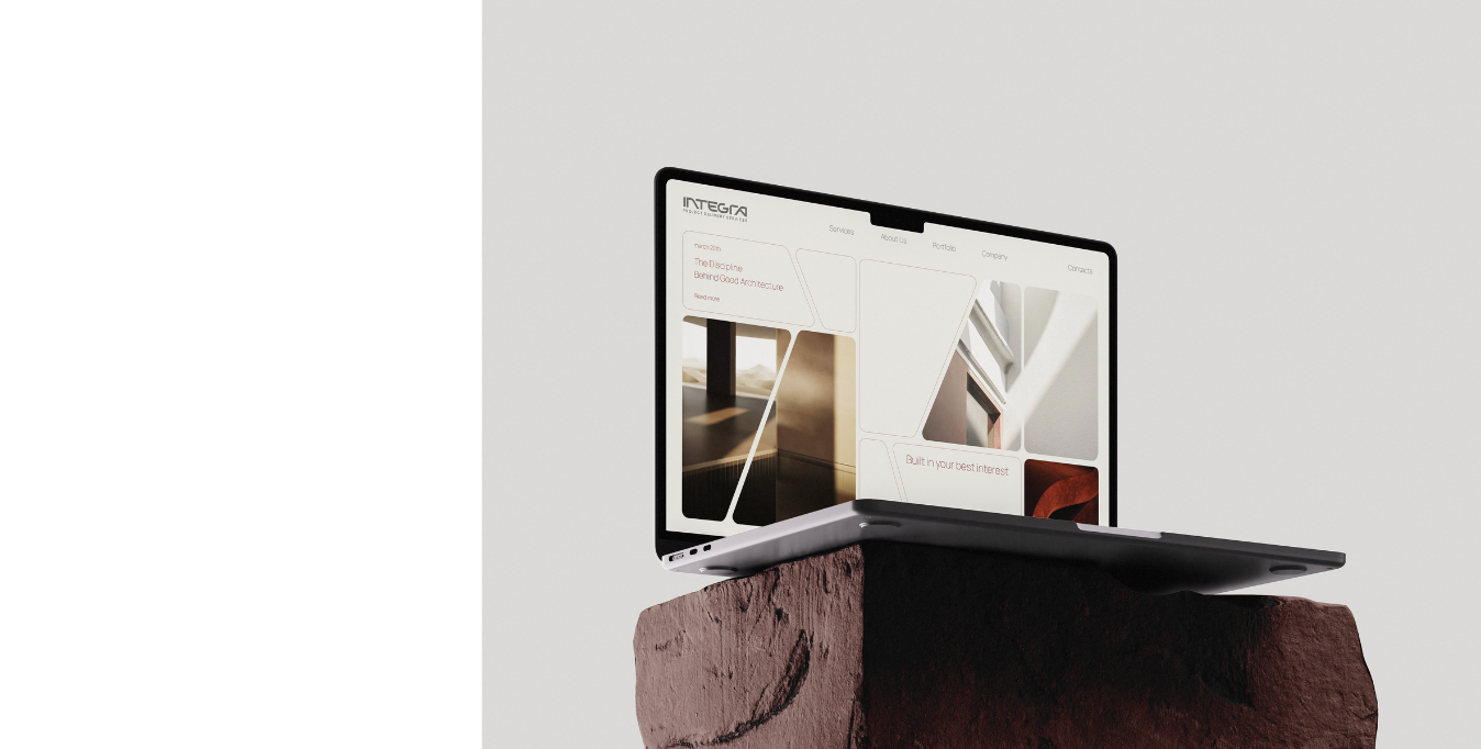
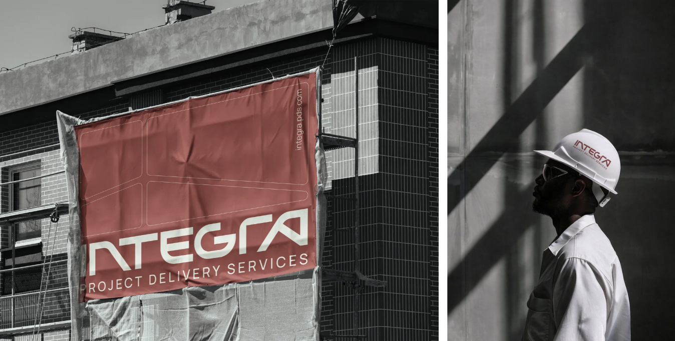
This flexibility allows the same brand to operate in very different settings: from a presentation or mobile screen to the physical context of a construction site.
The result is a complete identity system that gives INTEGRA a clear way to communicate a complex service — bringing strategy, naming and visual expression together around the principle that defines the company itself: integration.